Color Accuracy in Photography: What a Tiger's Orange Taught Keenan Hursh
- TeamBay

- 3 hours ago
- 10 min read

Every photographer eventually runs into the same disorienting moment: a photograph that looked right on a laptop arrives from the printer looking like a different image; greens gone muddy, skin tones shifted warm, a sky that felt electric now printing flat. It's rarely a mistake in the photograph itself. It's a breakdown somewhere in the color pipeline, shaped by more decisions than most photographers realize.

We wanted a working photographer's perspective on color accuracy in photography, not just a technical checklist, so we asked Keenan Hursh — a nature photographer, writer, and educator who leads photo safaris around the world — to walk through his own process using one photograph: a Bengal tiger captured on safari in India and printed through Bay Photo.
Here's Keenan.
Color is perceived entirely by the brain — wavelengths of light our environment hasn't absorbed, interpreted through millions of years of evolution. As Homo sapiens with three types of cones in our retinas, we get to experience a world chock-full of vibrant shades and hues: the greens of a rainforest, the reds and oranges of a mountainside in fall, the camouflage and mating displays that run through the animal kingdom. Color is everywhere in nature, and it's one of the most important elements of visual art, especially photography.
I'm Keenan Hursh, a professional nature photographer, writer, and educator. I'm passionate about sharing stories from my experiences in the world's wildest places, and in this article, I'm taking a deep dive into color: how it plays a key role in capturing images in the field, editing them on your computer, and going to print. Color catches a viewer's attention, conveys emotional responses, and allows a subject to pop against its environment — understanding it at a fundamental level matters.
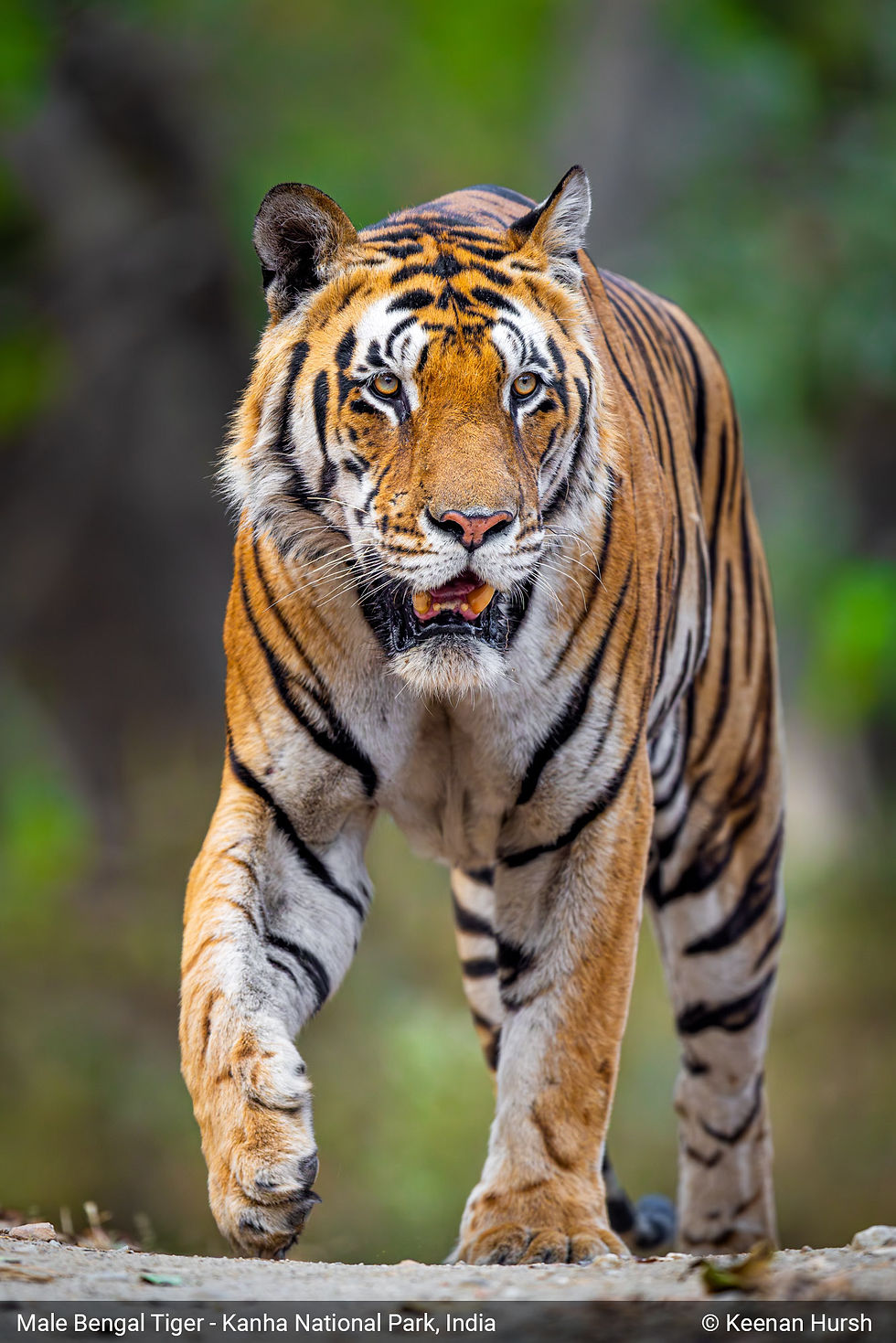
To keep things simple, I'm going to focus on just one photograph. I recently led a tiger photo safari in India for Backcountry Journeys and came home with a favorite image: a once-in-a-lifetime encounter up close with a massive male Bengal tiger. Color is a big part of why I love this shot, so I'll reference it throughout while covering the broader topics.
Alright, let's dive right on in and start at the beginning of the creative process – capturing images with your camera.
Capturing Images with Your Camera and the Importance of Color Theory in Photography
The lifecycle of a digital image starts when you release your shutter, absorb light with your camera's sensor, and create a digital file. From a purely scientific perspective, all we're doing is transforming light into information — but photography is not just a science; it's also a form of art and expression. Anyone can click a button, but there's a lot more that goes into a beautiful, meaningful, and impactful photograph.
The same is true of color. Our cameras absorb wavelengths of light and portray them as red, green, and blue values, but that's a small part of the story — color is one of the most important elements of any image because it significantly impacts how we experience and react to photographs. Slight variations in hue, tone, brightness, and saturation can transform a typical photograph into something magical, and it starts with capturing images out in the world.
Whenever we're out capturing images of nature, we should aim to keep color at the forefront of our decision-making process. I'm constantly asking myself if the colors being captured are strengthening or weakening my image, and one of the best places to start is with a few guiding questions I ask myself:
Are there too many colors in this scene, to a point that it's distracting?
Is there an absence of color potentially making my image dull or boring?
Are the colors in the scene complementing one another or not?
Are my white balance/color temperature settings accurately capturing the color I'm seeing with my eyes?
Are the colors in the scene allowing my subject to pop, or is it getting lost in the background?
Can I reorient myself or parts of my scene to better capitalize on the colors available?
One of the best ways to think about color in the field is to fall back on general color theory — specifically complementary and contrasting colors. If you remember opposite colors on the color wheel, you can apply that knowledge directly: in my tiger image, the subject is predominantly orange, and the background is close to green foliage in the forest. Blue is technically orange's true complementary color, but the green here is close enough to create a similar effect, letting the subject pop and stand out.
Beyond general color theory, I also think about how the human eye and brain perceive color on a subconscious, emotional level. Our eyes are naturally drawn to the warmest and brightest parts of an image, so a bright, warm subject against a cool, dark background is going to pop and catch the viewer's attention. In my tiger image, the subject is full of warm tones and brighter than the relatively dark forest behind it — a subtle detail that makes a big difference.
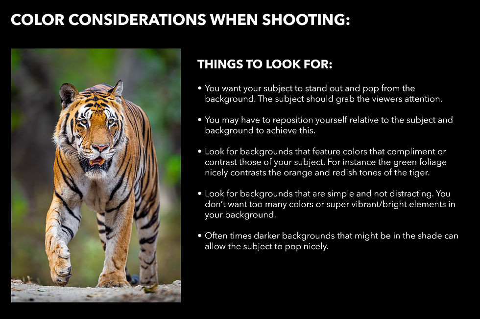
The key takeaway: really think about color when you're capturing images, especially the relationship between your subject and background. See if you can change your orientation to better capitalize on the colors in a scene and create a more compelling, eye-catching image.
Editing Images on Your Computer and Effective Color Correction
Capturing great images in the field is only part of the puzzle. Especially for those of us shooting in RAW, our photographs still have a long way to go before they're ready to print. Once you've downloaded your files, it's time for the post-processing workflow — I spend way more time editing than shooting, and for wildlife photography, this is especially true (culling alone can take days). Editing is where images come to life, and color is a vitally important part of that process.
Because photography is an art form, everything here is subjective — different photographers approach editing in drastically different ways, from taking a ton of creative liberties to barely altering an image at all. Before diving into color specifically, decide what you want to achieve and how many creative liberties you want to take.
I approach photography from a documentarian perspective, aiming to recreate what I saw with my own eyes rather than overdo the editing. In this tiger image, I did quite a bit of work on the RAW file, but the result still looks natural — most people aren't going to consciously notice the editing.

One of the most important places to start, when it comes to editing and ultimately printing, is selecting your color profile. There are many to choose from, but I'd recommend widely recognized profiles like sRGB or Adobe RGB — used across devices and platforms, they keep your images looking consistent. Adobe RGB is widely considered the gold standard for printing.
You should also make sure your monitor is calibrated correctly. Different monitors have different display settings, so colors that look right on one machine can look completely different on another — or when printed. I'd recommend a device that calibrates your monitor, or a monitor built to match your other devices; I bought a BenQ monitor designed to match the profile on my MacBook Pro. Calibration is often overlooked, but it's a very important part of achieving color accuracy in your images.
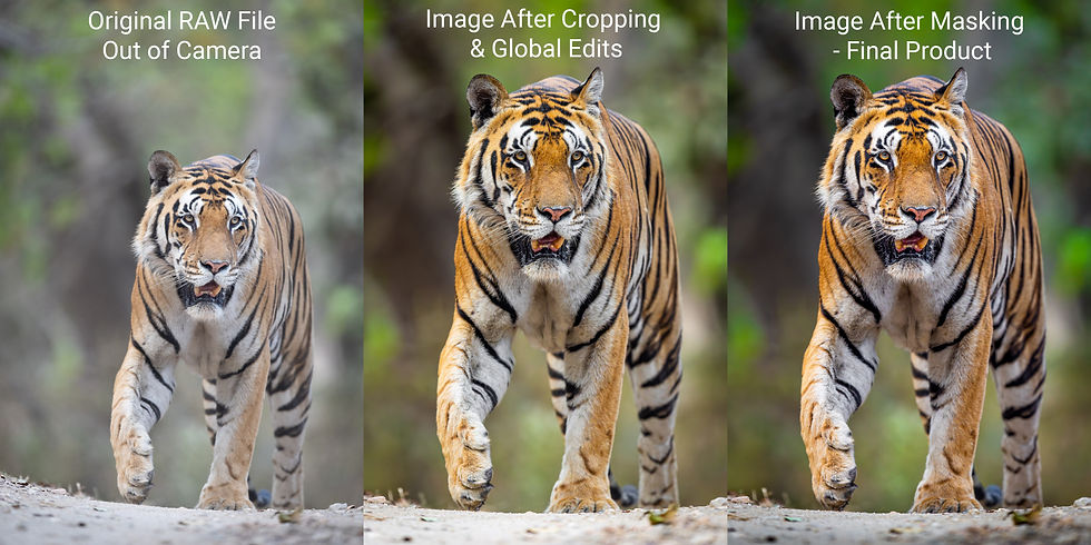
RAW files need a good amount of work, especially for color accuracy. I strongly encourage anyone editing their images to shoot in RAW — the files may not look great at first, but they store far more information and give you more creative control. Out-of-camera RAW files often look muddled and flat with reduced contrast and saturation, so you'll need to spend real time on the colors: adjusting temperature, white balance, tint, vibrance, saturation, hue, and luminance, sometimes down to individual color channels or masked areas. Bottom line, RAW files require a lot of work — especially when it comes to color correction.
Speaking of color correction, proceed with a soft touch. It's common, especially among photographers newer to editing, to overdo it — pushing sliders too far and ending up with unnatural-looking colors. If you're aiming for realism, proceed with caution and don't over-edit.
I'd also recommend stepping away from your images for a couple of days once you think you're done editing, then coming back with a fresh set of eyes. In the trenches of post-processing, it's easy to view your images through a skewed lens — stepping away and coming back gives you a more objective perspective and lets you make final tweaks.
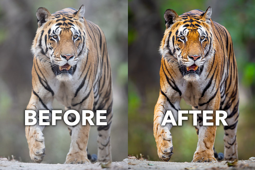
You can see this in practice with my tiger image: the RAW file right out of my camera is dull, flat, and undersaturated. Through basic color correction and masking edits, I recreated the colors I saw with my own eyes, pulling color out without overdoing it. After finishing the main edits, I forced myself to step away and come back a few days later — with fresh eyes, I noticed some tones and hues looked a little off, and a few more small tweaks got me to a better, more natural-looking image.
Achieving Color Accuracy and Quality When Printing Your Images
Once you've edited your favorite images and identified the ones that shine as portfolio pieces, one of the best ways to bring them to life is to print them. I'm a huge proponent of printing your best work — you're doing justice to the resolution and optical quality of your gear, creating a tangible piece of art that can be hung on a wall and enjoyed by others.
Quality prints are simply more engaging and immersive than small digital images ever will be.
In today's world, most photographs live purely as digital files on phone screens, shoved into a dark corner of the internet by an algorithm where hardly anyone gets to enjoy them — if you're lucky, someone glances at them for a couple of seconds while scrolling their feed. As photographers and artists, that reality can be frustrating. If you want to really enjoy and share your best images, printing is the way to go.
I'll reel things back and focus on color accuracy specifically. Color is just as important when printing as it is at every other stage — and these factors may be even more important once you get there.
If you've put in the time and effort to create a beautiful image, don't let avoidable mistakes at the printing stage undo all that work — you don't want to be unpleasantly surprised by a print you've likely invested hundreds of dollars in.
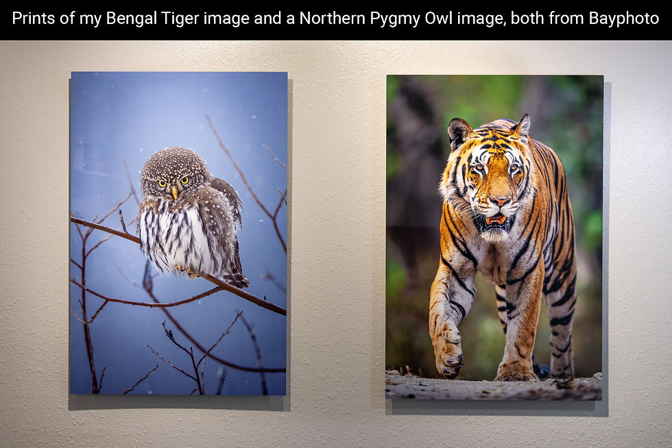
The first thing you can do to set yourself up for success is to choose a high-quality, reputable printing lab. I've used dozens of labs over the years, and the variations in print quality and color accuracy are all over the map — often worse when I've tried to save money with a cheaper alternative. I'd encourage you to spend a bit extra and work with a lab like Bay Photo, known for their quality and color accuracy that also stands behind their work: if a print comes back off, they'll make it right. I've had great success printing with Bay Photo and have yet to be disappointed.
If you're choosing to print images yourself, make sure to do ample research and purchase a printer that is not only highly rated and reviewed but will also suit your needs as an individual.
The key takeaway here is that you shouldn't skimp on printing after all the work you've put into creating a beautiful piece of art. Just as I wouldn't recommend putting a cheap filter on an expensive lens, I wouldn't ruin a beautiful photograph by using a cheap and low-quality printer.
Another important thing to keep in mind is the color profile and file settings you select when exporting. Whatever software you use, one of the most important choices is, again, a widely accepted color profile like Adobe RGB. Beyond that, make sure your file isn't being compressed: export at full resolution as either a JPEG or TIFF.
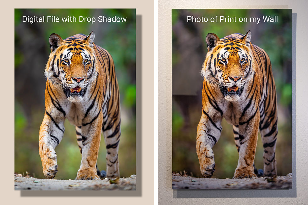
As you can see from my tiger image above, Bay Photo absolutely hit the ball out of the park. On the left is my edited digital file, and on the right is the final print hanging on the wall (I added a light tan background and drop shadow to the digital file for a more direct comparison; keep in mind that room lighting affects the print photo slightly). The quality and resolution are spectacular, and the color accuracy is spot on — I couldn't ask for a better lab to work with!
Ultimately, achieving color accuracy is just as important when printing as at every other stage of the journey. From capturing images in the field to editing and ultimately printing your best work, you should strive to have colors, color theory, and color accuracy at the forefront of your decision-making process every step of the way.
Final Thoughts
Color is an incredibly magical, important, and influential part of how we all experience the world around us — it affects how we experience our environment and visual art like photography, pulling viewers into an image and evoking strong emotional reactions.
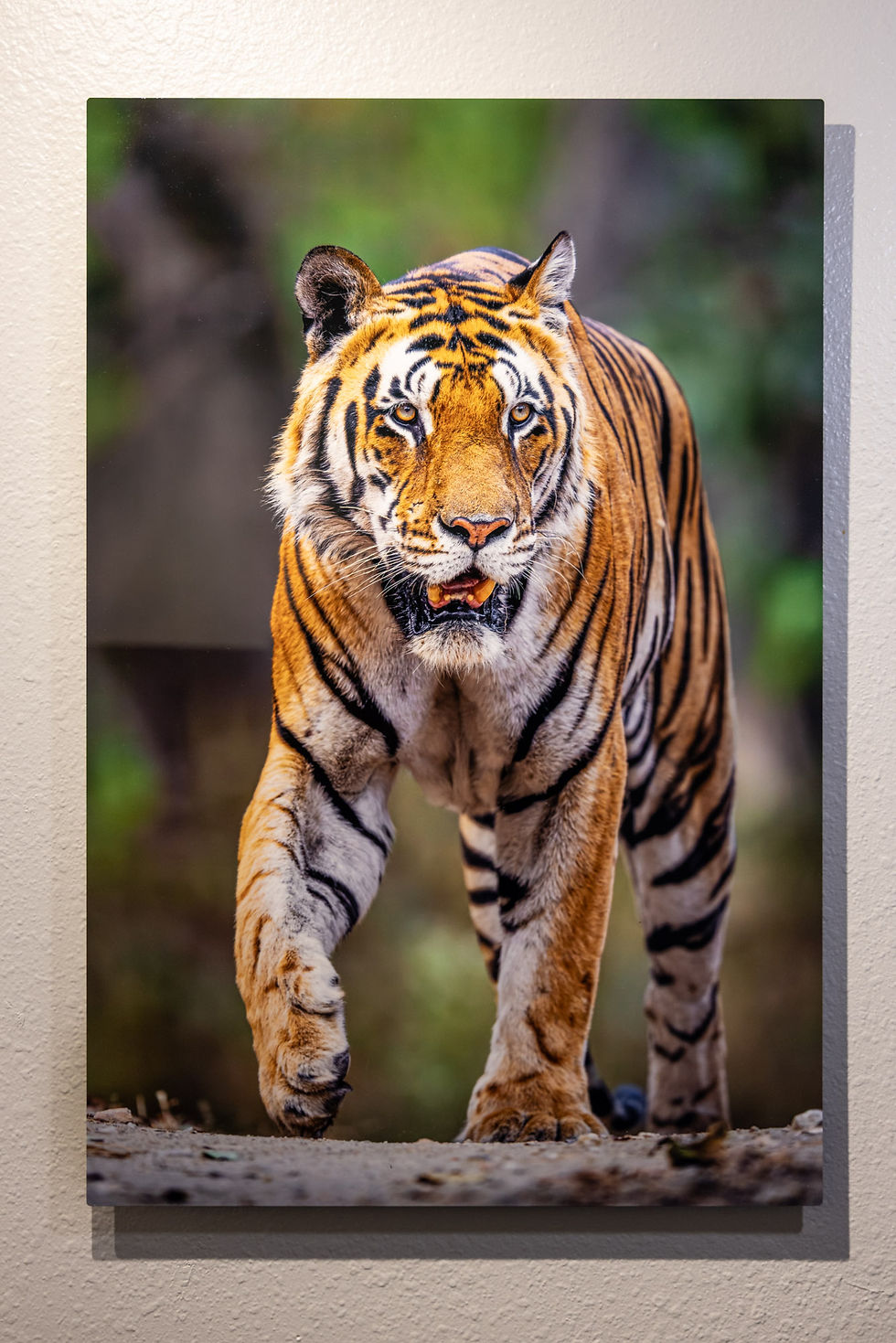
I hope you've enjoyed this article and taken something away that helps your photography. Color plays a vital role in the entire process: capturing images with your camera, transforming RAW files into something dynamic and beautiful, and ultimately bringing your photographs to life as physical, printed pieces of artwork.
It was an absolute privilege to lead this tiger safari in India, and I'm thrilled with both the image I captured and the print I got from Bay Photo. I couldn't be happier with the color accuracy and overall quality.
Thanks for reading, and best of luck on your next nature photography adventure.
— Keenan Hursh
Applying Color Accuracy in Photography to Your Own Prints
Keenan's process makes one thing clear: color accuracy isn't a single decision made at the printer. It's a chain of decisions that starts the moment light hits the sensor. A calibrated monitor and the right color profile won't fix a scene that wasn't read carefully in the field, and a well-edited file can still print differently if the lab on the other end doesn't handle color consistently.
Download Bay Photo's ICC profile before you order, and soft-proof your file for a reliable preview of how your color will translate. Then bring that file to a lab built to carry it through accurately. Print your next image with Bay Photo and see the color you edited reflected in the final print.
designed specifically for professional photographers and artists like you in mind.
Stay connected with us on:
Images by:
Keenan Hursh